A Gendered Narrative:
An exploration of the Tate’s Archive through data and network visualisations.
The following are visualisations exploring the dataset that the Tate Modern made public when they digitized their archive in 2014. All files used are free to download from https://github.com/tategallery/collection.
When I started exploring the Tate dataset, the scale of it was a bit overwhelming; there were 3,533 artists with nearly 70,000 listed artworks!
I started off by throwing the basic .csv files from Excel into data visualisation sites such as datawrapper and RAWGraphs.
From the outset I had to rule out the idea of being able to do anything with the full dataset for the artworks themselves, as it was beyond the ability of my computer to process! Similarly I found that even the much smaller artists’ dataset was a bit too much to make sense out of when viewed as a single overall visualisation.
I had to simplify the categories in the dataset down to a couple basic columns or strings of interest in order to generate a visual that could start to offer some kind of a statement or narrative.
I was interested to see how I might be able to journey from this large dataset of 3,500+ artists down to an individual artist within in it, noting trends in the data along the way, from the macro down to the micro, and seeing what story these trends might tell.
The category from the dataset that I intially chose to focus on was ‘gender’, which as we’ll see ended up offering a fairly visual narrative of inequality.

This example was created in a template from RAWGraphs that illustrates a simple overall breakdown in the number of artists by gender. We can immediately see the gender divide in the archive, with works by Male artists forming the overwhelming majority of the collection.
What this basic visualisation doesn’t allow us to see is a timeline that might help to visualise how much of this breakdown was skewed or informed by a historical context.
For instance, I wouldn’t be surprised at the fact that very few female artists would have been part of the collection a hundred years ago, and I would be interested to see what a more current comparison might look like.
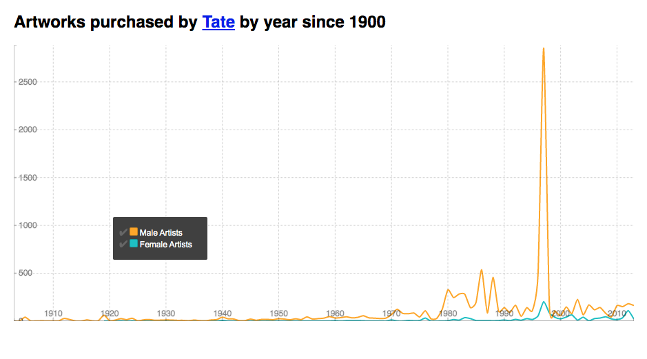
Here is a visualisation created by Zenlan (click link for interractive version) that shows the number of artworks purchased by the Tate since 1900, broken down into gender and arranged on a timeline. It echoes the illustration on the left in terms of gender breakdown (and raises some obvious questions as to the spike of male purchases in 1997), and offers a more modern commentary.
However it doesn’t allow us to further explore individual artists in the collection, or to pull much more information from it beyond gender data.
For my own data visualisations I wanted to find a template that would allow me to visualise more aspects of the dataset.
I started to search for a template that would help me to visualize the full dataset in small chunks at a time, while also allowing for an overall timeline of the dataset in order to give a sense of linear context. I also wanted the visualisation to be quite colourful and interractive, as I felt that was important for an exploration of a visual arts archive. The data visualisation templates offered by Flourish Studio seemed to have much of the look and the feel of what I was after, but again I encountered difficulty in finding the right template to tell the story I was trying to tell.
I finally came across a template (shown here on the right) meant for visualizing survey results, aptly titled ‘Survey’. An interesting element was a map feature that allowed for inputting geographic coordinates to visualise them on a world map, as well as featuring a timeline slider that allowed for navigation of the dataset based on a date value column.
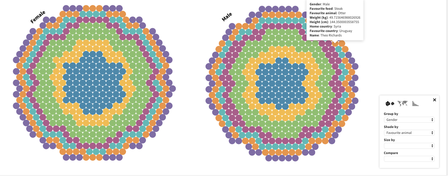
The above visualisation was created using the Survey template that I just mentioned. By selecting ‘gender’ in both the ‘Group by’ and ‘Shade by’ tabs on the control panel, we can look at the gender breakdown based on the year of artists birth in the tate collection for each year (this column was chosen because it was the most complete of the columns in terms of gaps or missing dates). Hovering over a triangle will bring up the accompanying metadata on the artist, and by clicking on the triangle, this metadata will remain visible so that you can navigate to the bottom and copy the artist’s direct url to their page on the Tate Modern website.
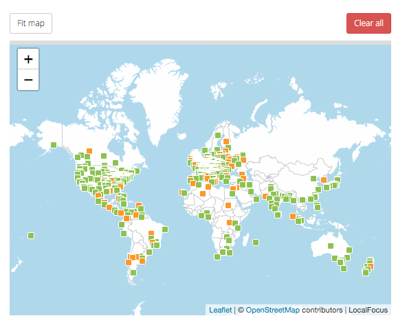
Clicking on the world map will try to show where the artists were born (although gaps in the dataset create numerous errors here), in an attempt to give a sense of where the artists in the collection are represented geographically.
To create the map feature I uploaded the ‘place of birth’ names in the original .csv file to:
https://geocode.localfocus.nl/,
(a ‘batch geocoder for journalists’) and generated latitude and longitude values for each artists’ country of birth.
Shown here on the right is a screengrab of the final results, showing that the vast majority of the collection is stacked in Europe, with the next greatest density in North America.
An immediate problem that I ran into was the amount of gaps in the original dataset, as well as the fact that the country place names were all in their local dialect and spelling (i.e. Ireland is listed as Éire, and Germany is listed as Deutschland, etc.) which caused problems for the programme in assigning correct values.
I wanted to transition down from the full dataset to a smaller chunk that I could draw more information out of, moving from the macro scale down towards the micro, and giving me a chance to correct some of these gaps and issues with spelling of place names. I thought that the best way to do this would be to use the same visualisation template, but to use a much smaller dataset that I would be able to manually inspect and correct for gaps, innacuracies, etc. I decided to focus on an active period in the timeline with a fairly equitable gender breakdown, where the artists would still be alive and practising today. Using this criteria I landed on a five year period of artists born between 1968-73, who would now be mid-to-late career and well established. The visualisation here below is the result of this process:
By playing with the ‘Group by’ and ‘Shade by’ tabs in the control panel, and toggling through the timeline, we can see that the majority of artists represented are still male, and that the majority of artists are also still from Europe and the United States (the only year that we have an equal gender breakdown is 1972). The map feature now works without any anomolies, and creates a nice visual of geographic placement.
The smaller dataset also gave me the option of exploring the supporting .JSON files that accompany each artist in the archive. I hadn’t been able to use these before because with my limited coding ability I had only been able to figure out how to convert these files to a .csv file one at a time, meaning that it wouldn’t be feasible for use with the larger dataset. But now by focusing on a five year period, I wanted to see if the additional supporting metadata found in the .JSON files would shed any further light on the artists in the archive.
I started the process of manually inspecting each of the .JSON files of the 130+ artists found between 1968-73, hoping to find information about associated artists’ movements, mediums of production, thematic concerns, etc. I was fairly dissapointed to find that there was only a small group of artists that had any further metadata supplied in the .JSON files, and also that there were some artists that I was familiar with and knew that had data that wasn’t being represented at all. I decided to inspect this smaller group of artists and attempt to fill in some obvious gaps in the existing metadata, and after looking at the networking visualisation site Onodo, I felt that creating an artists network based on the results might be the best way to visualise any connections that could be made.
Below is an embed of the network that I built in Onodo; it’s interractive in that it allows for the user to drag the different nodes out as they wish, highlighting different links and networks that exist within the overall network. Clicking on an individual node will bring up further information on the artist, and provide a link to their wikipedia page.
After creating each artist as a ‘node’ on the network, I inputted their .JSON metadata as ‘links’ within the network between them. For instance, artists listed in the .JSON files as being part of a specific artist’s group or movement, such as the ‘YBAs’ (Young British Artists) or ‘Feminist Art’ are linked together in the network, and also artists that had associated medium(s) such as ‘photography’ or ‘installation art’.
The results of the finished network analysis showed that the artist that had the most links to other artists was Darren Almond. To complete the journey from full dataset down to individual artist, I created a gigapixel storymap through StorymapJS that describes Almond’s work through his links to the other artists in the Onodo network visualisation.
The results of the finished network analysis showed that the artist that had the most links to other artists was Darren Almond. To complete the journey from full dataset down to individual artist, I created a gigapixel storymap through StorymapJS that describes Almond’s work through his links to the other artists in the Onodo network visualisation.
Conclusion
We can see from this examination of the Tate dataset that the majority of artists represented in the Tate archive are males from Europe and North America. By navigating away from the full dataset and examining a more contemporary slice of the pie, I was hoping to perhaps uncover a more equitable ending to the story. The results of the small artist network visualisation reveal a much more diverse network than existed historically in the past, however the artist with the most connections is still a male artist from the United Kingdom.
It would appear that for artists born between 1968-73 the story being told is possibly a familiar one; representation favours western males.
If you have any questions/corrections/criticisms regarding any of the above please do get in touch with me at conallcary@gmail.com, I would love to hear from you!